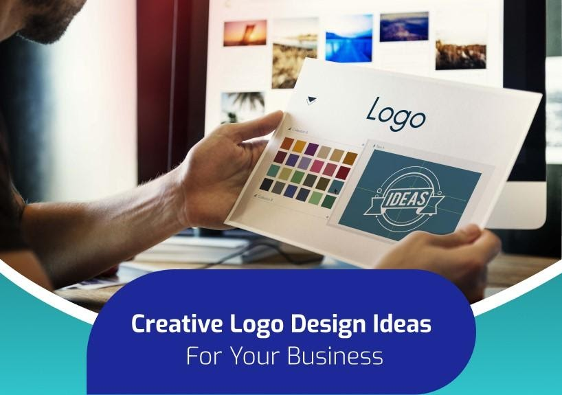
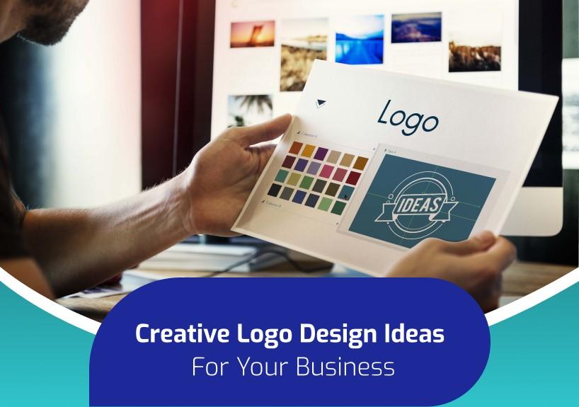
A logo is a representation of a brand or an organization. It’s the emblem that reminds people who you are and what you do. However, there are a lot of other elements that go into logo designing than simply visual components. The design is required to promote a sturdy identity and appeal to the target customers in order to be successful.
We are halfway through 2021 and can expect fierce competition all around. From launching a new business to reinventing the old one, or escorting your old logo up-to-date, the below-mentioned logo design trends will inspire you to head confidently towards the future. Let’s check them out!
Logo Design Trends that will Rule the Design World in 2021
- Geometry-Based
Be it simple or overlapping geometry, they are on the rise and can do wonders to your logo. The power of shapes such as squares, circles, and triangles form the foundation for solid imagery.
With a geometry-based logo design, an impression of illusion can effortlessly be evoked along with the required depth and structure. Designers can get creative with simple geometric shapes by overlapping them and creating images by merging shapes. It leaves some amazing effects and colour blends.
- 3D & Isometric
2021 is surely going to be a 3D bonanza in the world of design. Incorporating shading, highlights, and shadows can change your logo into a new cutting-edge design.
If you have not checked the stylish patterns of the 3D logo or want a completely new design that is going to tick all the creative boxes, engage aprofessional logo design company that can design a creative logo to enhance your brand proposition.
- Ink Style Oriented
Ink style-oriented logos are always high in demand. They exhibit the most complex hatched lines with wonderful details that will surely double the beauty of your logo.
Qualities such as the focus on details and distinct individuality make an ink-styled logo classy and head-turning.
- Negative Space
Negative space logos may appear simple, but they are quite technical to pull off. It’s a blank space section of a logo inside or around a graphic element or letter form.
For example, Rocket Golf puts two golf T-shirts close together but uses the space between them to create the image of a rocket. Playing around with this can really work like magic if done with a clever concept.
- Wordmark Oriented
Wordmark logos are, literally, logos made with words. To make it clearer, let’s take a few famous examples such as Google, MasterCard, and eBay. All of them use their own brand name in the logo but employing their own stylized font.
Font design is constantly pushing the boundaries and helping in driving the attention of the target audience. Hence, a nicely designed wordmark logo can easily be used anywhere and would do its job in a great way without creating any fuss.
- Gradient & Vivid Colours
Gradient colouring adds depth and tangible quality to your logo design. It can stir up different moods and feelings and emphasize telling a brand story through vivid colours.
One of the ways to stand out from the crowd is by blowing away the cobwebs of the old colour standards and going wild. For example, when you think of John Deere, the green colour which is used heavily in their logo comes to your mind, right? That’s because the superb use of green colour makes the brand recognizable as well as sets it apart from competitors.
- Abstract Logos
Abstract logos are quite similar to pictorial logos as they focus, primarily, on a graphic. But the only difference is that, instead of using a recognizable image, an abstract logo reflects an abstract shape.
Furthermore, it involves minimal use of elements and helps the designers create a message without cluttering a small space. According to the experts of brand identity design services, as abstract logos incorporate minimum use of elements, viewers get a brand message quickly and in a clearer way.
- Simple Transitions
If you don’t want your logo to be flashy, a plain and subtle transition can be a great way to make it creative. Flip Flop, for instance, only animates the third letter (the “i” and “o” flip back & forth). But, it’s incredibly impressive as the motion not only shows the name but also explains its meaning.
Wrapping Up
There are a lot of ways to create an impressive logo that expresses your business in the best way possible. Now that you know what kind of logo your brand needs, it’s time to get started.
Engage a renowned logo design company that understands your requirements and designs a logo that will showcase your brand identity and appeal to your customers.